
Wepsol
✦
BRAND
MID-WEIGHT DESIGNER
⏳ 5 MONTHS

STORY
Wepsol was reshaping how workplaces function, so the story began with defining what fluid work should feel like. Our role was to translate that idea into an energetic identity that connected technology, motion, and human clarity.
OPPORTUNITY
The brand needed a cohesive visual foundation that could unify multiple services while still feeling bold, modern and energetic. This created an opportunity to craft an expressive system that elevated Wepsol’s identity, improved recognition, and enabled consistent design across product experiences and communication touchpoints.
DESIGN
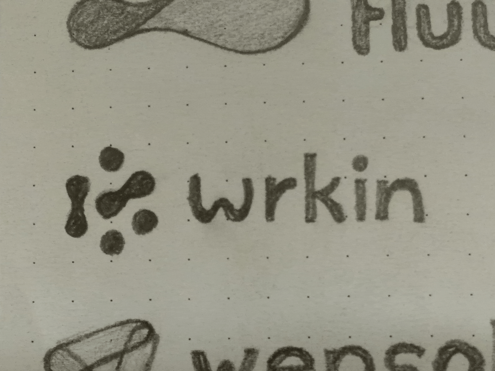
The design direction focused on building a visual system that balanced clarity with energy. A bold logo, vibrant palette and structured type hierarchy shaped the foundation. Every element was crafted to support flexibility, strengthen recognition and express Wepsol’s idea of fluid, modern work.
IDENTITY
The identity captured Wepsol’s spirit through a confident mark, vibrant colours and a clear typographic rhythm. It created a cohesive presence that felt modern, expressive and adaptable, allowing the brand to speak consistently across digital spaces, product interfaces and everyday workplace communication.

GUIDELINES + COLOUR PALETTE + ICONOGRAPHY


MOODBOARD + VISUAL LANGUAGE


BRAND APPLICATIONS
The system extended into stationery, office signage and brand film, each expressing the identity with consistent colour, type and clarity. These touchpoints showcased how the brand translated into physical and motion environments, creating a cohesive, recognisable presence across Wepsol’s everyday interactions.
BRAND COMMUNICATION


OFFICE SIGNAGE


BRAND FILM
