
Prarthana School
✦
BRAND + DIGITAL
MID-WEIGHT DESIGNER
⏳ 6 MONTHS

STORY
Prarthana is a school shaped by openness, a place where learning begins with Yes and every child is encouraged to grow with confidence. My role was to extend this belief into a warm visual identity built on soft curves, calm typography, and expressive colour. The prospectus and collaterals became the main canvas for this system, carrying the school’s values with clarity and ease.
OPPORTUNITY
Prarthana’s philosophy of inclusivity and affirmation was strong, but its visual expression was scattered across campuses and communication. This created an opportunity to build a unified identity that translated the Yes mindset into a clear, warm, and consistent system for print, digital, and environmental touchpoints.
DESIGN
The design system translates Prarthana’s Yes philosophy into a warm, confident visual language. Soft curves, expressive scale, and a grounded ochre palette form the core of the identity. Typography is calm and human, giving the school a voice that feels welcoming while staying clear and dependable. Every element was built to echo the school’s belief that learning grows through openness and encouragement.
This language extends across the prospectus, collaterals, digital templates, and brand film. The layouts carry generous space, gentle rhythm, and a balance between affirmation and information. Photography stays candid and child centered, allowing real moments to shape the tone. Together, these pieces create a coherent identity that feels rooted, inclusive, and unmistakably Prarthana.
BRAND CULTURE MODEL

BRAND PILLARS

BRAND VOICE

IDENTITY
Namah
Respectful ✦ Egoless ✦ A Natural Action
Namah is a Sanskrit term often used in prayers as a humble, respectful, and egoless salutation from the inner self. The identity is inspired by the Namah, symbolic of the inner self, and kindles the fire within every child. So that they find their own identity, confidence and strength to be whomever they want to be in life, be limitless.
The form is inspired by a pair of folded hands, raised upwards, a universal symbol of prayer. Almost like a flame, it is a bold, organic symbol, with a mild gradient. The typeface is modern and minimalistic.
LOGO REDESIGN
MOODBOARD + COLOUR PALETTE


VISUAL LANGUAGE
The visual language grows from Prarthana’s Yes philosophy. Soft curves guide compositions, creating motion without noise. Warm ochre and quiet neutrals set the emotional tone, while generous spacing keeps the layouts light.
Photography stays candid and child-centred, allowing real moments to shape how each piece breathes. Together, these elements form a system that feels grounded, inclusive, and unmistakably Prarthana.


BRAND APPLICATIONS
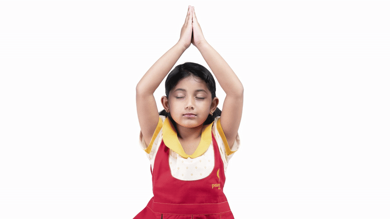
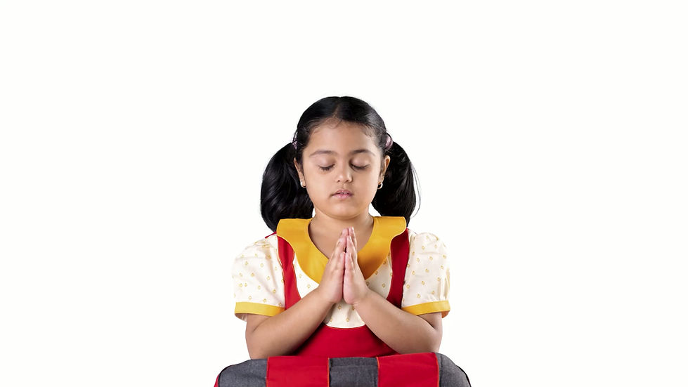
The applications bring the identity into the school’s daily environment through print and experiential touchpoints. Posters, event materials, and classroom graphics carry the warm palette, soft curves, and gentle typography into formats that feel natural inside Prarthana. The photoshoot adds a human layer to the system, capturing students in candid moments and posed portraits in their new uniforms, giving the brand a sense of real presence and everyday warmth.
The brand film introduces motion and atmosphere, reflecting the school’s rhythm through natural light and genuine interactions. The brand website follows the same clarity and tone, offering simple formats for communication across the campuses. Together, these applications create a coherent system across print, photography, film, and digital, giving Prarthana a unified and grounded expression.
BRAND COMMUNICATION


PHOTOSHOOT


BRAND FILM
WEBSITE


