36 Hastings Road
✦
BRAND + PACKAGING
ROLE: VISUAL DESIGNER
TIME: 3 MONTHS

STORY
36 Hastings Road was a start-up incubated within Spread Design, driven by a bold vision to revolutionise India’s drinks industry. The brand aimed to do more than simply create mixers; it sought to enhance customer experiences, empower bartenders, and support bar owners. My challenge was to develop a compelling identity and packaging system for premium mixers that would resonate with millennial consumers while addressing the lack of innovation in the alcohol mixer market.
OPPORTUNITY
The premium spirits market in India sees annual sales of 67 million units and over 1 billion mixer bottles consumed each year. Despite this enormous market, the mixer category has been lacking in innovation and compelling brand storytelling. Our target audience, HENRYs (High Earners, Not Rich Yet), demands more than just functional products; they are looking for authentic brand narratives and meaningful experiences.
 |  |  |
|---|---|---|
 |  |
DESIGN
As we considered various design options, a key question emerged: how can we revive traditional Indian styles and incorporate those patterns once more? With this in mind, we focused on three design paths. These paths draw inspiration from the art, culture, and architecture that were prominent in India during the British era.

ROUTE 1: STYLE MODERNE
Inspired by Art Deco, that opens minds, represents luxury, glamour, exuberance and faith in human progress. Embraced globally, it celebrates the liberation of human spirit, catalysed by rapid rise of commerce and technology. Adapted by possibly every culture on the planet.


ROUTE 2: INDIART (SELECTED)
Inspired by the diversity and richness of the artistic and cultural ethos of India. A journey of art, life and stories that spans over two centuries. Rendered artistically.


ROUTE 3: INDIAN SPIRIT
Evoking the India’s diversity DNA. A tribute to the true spirit of the nation. Inspired by the vernacular, art and craft, diverse cultural influences presented as contemporary interpretations. A cultural mosaic.


IDENTITY
Shortlisted and Inspired by the Indian Devanagiri Script and Tiger Features.
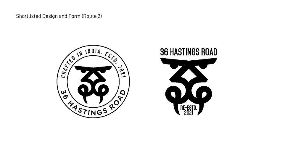

REFINEMENT
Devanagiri calligraphy was taken as inspiration, and hand-drawn forms were scanned and outlined for the Identity.
 |  |  |
|---|---|---|
 |
FINAL FORM: INDIA'S PRIDE
The second design concept, Indiart, inspired the identity by transforming the Devanagari script into the shape of India's national animal, the tiger, symbolising 36 Hastings Road. This design reflects Indian culture with its unique form and circular elements reminiscent of a premium coin.
The typeface "Re-estd 2021" emphasises the brand's mission of reviving India's cultural spirit. The organic, handmade design is digitally adjusted with Devanagari calligraphy and inspired by the One Ana Coin, featuring rich details alongside the DIN font.


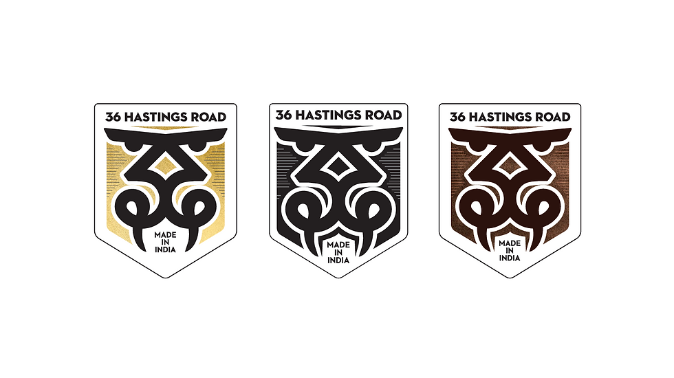
PACKAGING
The product packaging and story were inspired by old India. Revival being the theme, the identities looked back at colonial India. The packaging takes us back to that time to bring out the lost essence of India, to look at all the influences that made India what it is today. Not only the British influences but also the French, Portuguese, as well as Dutch influences were considered.
1. BOMBAY SODA CO.

Western India’s first ‘aerated water’ factory was set up in Bombay in 1837 by Henry Rogers.

Earliest reference to raspberry soda in Bombay is from 1907, manufactured by Duke & Sons, the Parsi connection with the Indian soda or “aerated water” industry
BOTTLE & PACKAGING SPECIFICATIONS


Create Your First Project
Start adding your projects to your portfolio. Click on "Manage Projects" to get started