Chanakya University
✦
SIGNAGE + WAYFINDING
MID-WEIGHT DESIGNER
⏳ 5 MONTHS

STORY
Chanakya University was developing a new campus and needed a clear and reliable wayfinding system. My role at Spread was to design a simple and consistent visual language that could guide people smoothly while reflecting the identity of the institution. By understanding how the campus functioned and how people would move through it, I created a system that brought clarity to a large environment and supported everyday navigation.
OPPORTUNITY
Chanakya University was developing a new campus and needed a clear and reliable wayfinding system. This created the opportunity to build a simple and consistent visual language that could guide people smoothly while reflecting the identity of the institution. By studying the needs of the space and the movement of its users, the project allowed the creation of a system that brought clarity to a large environment and improved everyday navigation.
BRIEF
Chanakya University required a complete signage and wayfinding system for its new multi building campus. The goal was to establish a clear and structured navigation experience for students, faculty, visitors, and staff as they moved between academic, residential, and communal spaces. My responsibility was to translate the university’s identity into a functional visual system that could work across entrances, pathways, buildings, and interiors while remaining intuitive, accessible, and future ready.
 |  |  |
|---|---|---|
 |  |
INSIGHTS
I studied how people would move through the new campus and identified the key paths between academic blocks, housing, and shared spaces.
The university’s brand and architectural cues helped define the tone of the system, while accessibility guidelines shaped the clarity, contrast, and hierarchy of information.
These insights formed the base for a visual language that felt structured, intuitive, and grounded in the identity of the institution.

DESIGN
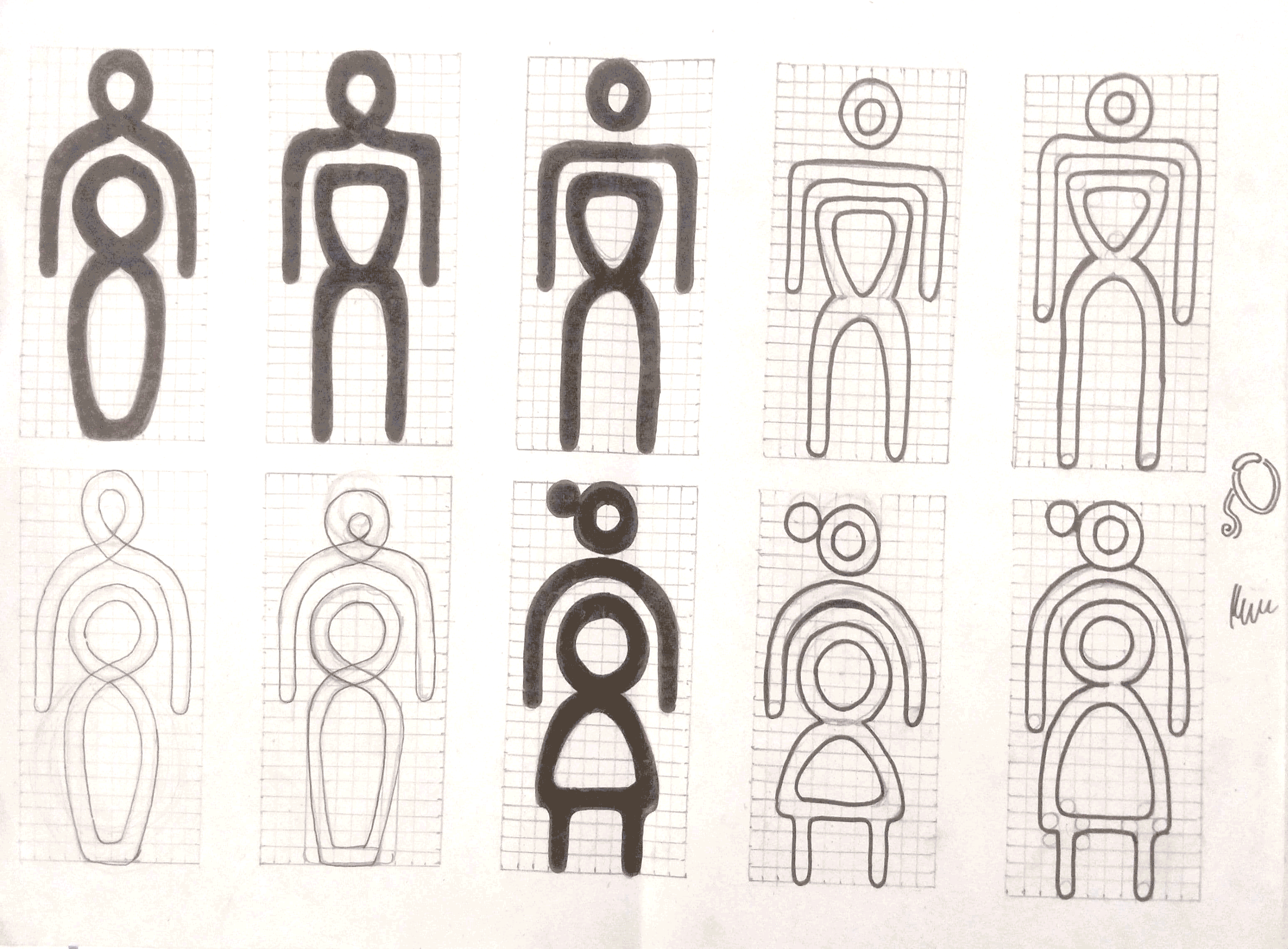
The visual language for the wayfinding system was built by combining the university’s brand cues with the functional needs of the campus. I focused on creating a system that felt structured, calm, and easy to follow across both outdoor and indoor environments. The brand’s forms and colours guided the shapes, hierarchy, and tone of the signage.
Architectural references influenced the geometry and rhythm of icons and holding devices. Accessibility principles shaped the choice of scale, contrast, and placement so that information stayed readable from different distances. Together, these decisions created a consistent framework that could adapt to buildings, paths, entry points, and user flows across the campus.
ROUTE: GEOMETRIC INTRICATE
Taking forward the Ideals and Ideas of Chanakya University: “Jnaana, Iccha, Kriya” to develop the graphic and visual language.
Geometric and light graphics complement the organic and heavy logoform.

DESIGN DIRECTION


VISUAL LANGUAGE
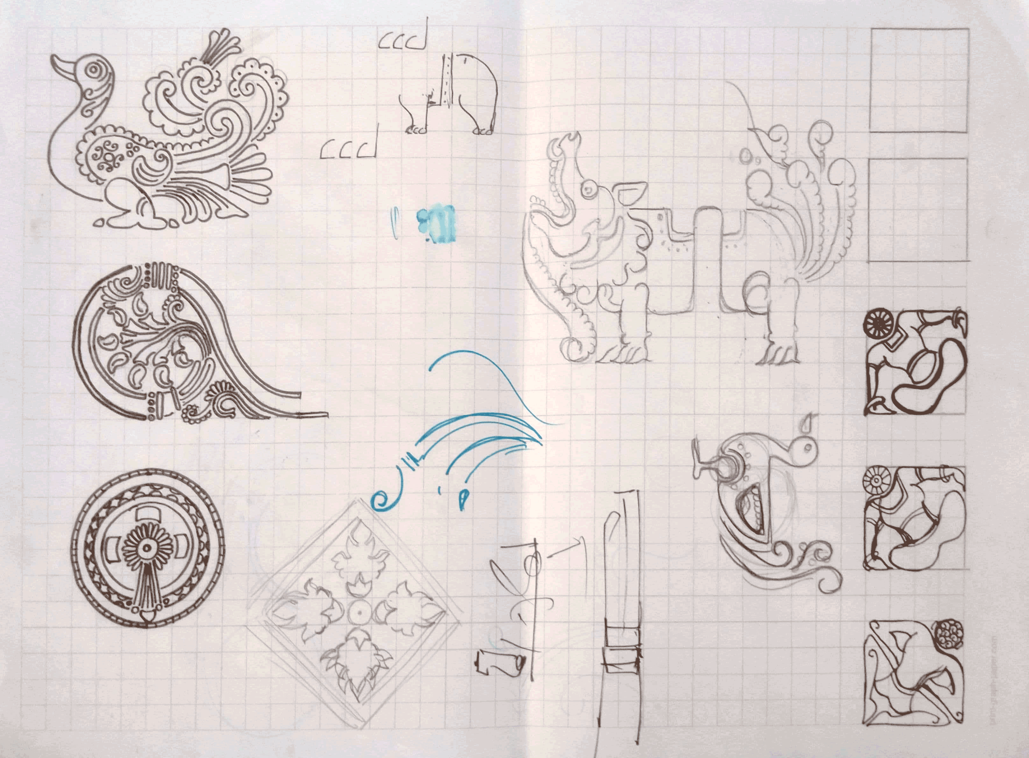
The visual language combined the university’s brand cues with cultural and architectural references from Karnataka's history.
Details from Hoysala geometry guided the shapes and proportions of holding devices and icons, giving the system a grounded and consistent structure.

GRAPHIC ELEMENTS


MATERIAL SAMPLES

ICONOGRAPHY


SIGNAGE
The signage system was designed to work seamlessly across the campus, from large outdoor identifiers to detailed interior cues. Each sign followed the same visual structure, colour hierarchy, and icon style, which kept the experience consistent as people moved through different buildings and pathways. The forms were guided by the brand’s geometry and Hoysala inspired proportions, while scale and contrast were refined to stay readable in varying environments. This created a clear and dependable system that supported daily navigation for students, faculty, and visitors.
EXTERNAL SIGNAGE SYSTEM


FLAT GRAPHICS


PRODUCTION SAMPLES


RENDERS


INTERNAL SIGNAGE SYSTEM

FLAT GRAPHICS


PRODUCTION SAMPLES


RENDERS


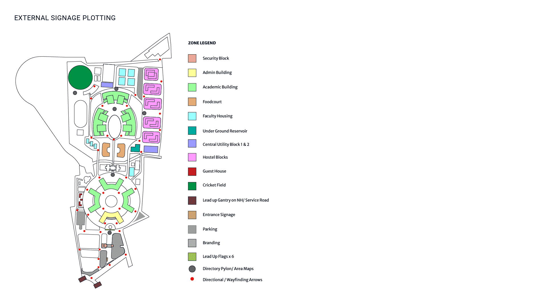
SIGNAGE PLOTTING
Signage plotting was the moment the system met the real campus. Walking through the paths and junctions helped reveal where users would look for direction and where clarity mattered most.
Each placement became a small but meaningful decision that shaped how people would move across the space. This stage tied the entire system together, turning the visual language into a smooth, continuous navigation experience.